Best Light Codex Skins: 6 Airy Themes for Low-Eye-Strain Coding
Light-airy Codex skins ranked by readability and eye comfort — Clear Glass, Berry, Sakura Pink Dawn, and more. Pick the one that fits your desk lighting.
Light themes get a bad reputation among developers who grew up on dark mode. The stereotype is that white backgrounds strain your eyes during late-night coding sessions. That stereotype is half-true — light themes do hurt in the dark. But in a well-lit room, a good light skin can be easier on your eyes than any dark theme.
The light-airy category in the Codex skin library has six curated themes. They share one trait: low contrast by design. That makes them the easiest skin group to check against accessibility contrast requirements, and the friendliest entry point for people who are new to customizing their editor.
Clear Glass: the clean desk approach
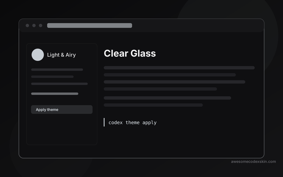
Clear Glass is built into the Codex Dream Skin engine. It looks like a frosted glass surface — not stark white, not warm cream, just a neutral light field that gets out of the way.
The mood is “clean.” That means the syntax colors are readable without shouting, the UI chrome blends into the background, and nothing competes for your attention. It is the Codex equivalent of a tidy desk: everything has a place, nothing is in your face.
Clear Glass works best when your room lighting is even. Under a warm desk lamp it can feel a little sterile, but under natural daylight it disappears into the environment and lets the code speak.
Berry: the soft handbook
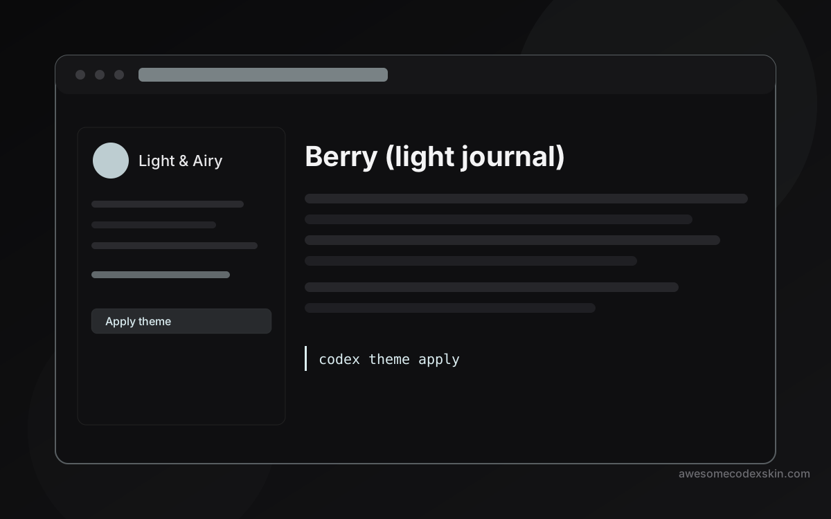
Berry is a ReTheme engine skin that calls itself a “handbook” theme. The description says pastel, and the hex code #DCEEF2 confirms it — that is a pale blue-green that feels more like a sketchbook than a terminal.
The mood tag is “soft,” and it shows. Berry rounds off the sharp edges that some light themes leave behind. Syntax highlights land gently. Line numbers stay visible without being loud. The overall effect is a workspace that feels like it was designed for reading, not for staring down.
Berry pairs well with the accessibility contrast guide if you want to verify that the pastel tones still meet readability thresholds. They do, but it is worth checking if you have sensitivity to low-contrast text.
Sakura Pink Dawn: spring in your editor
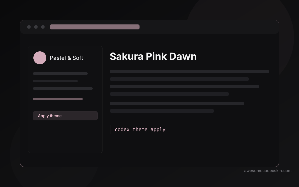
Sakura Pink Dawn is the standout of the pastel-soft trio that arrived with the latest index update. The cherry blossom palette is immediate — you know what you are getting before you even open the editor.
This is not a skin for people who want their code to look serious. It is for people who want their workspace to feel like spring. The pink tones are low-saturation enough to stay readable, high enough to give the interface personality.
If you work during the day and your monitor faces a window, Sakura Pink Dawn can actually help your eyes by reducing the contrast between the bright screen and the bright room. That is a small thing, but it adds up over a long coding session.
Pink Custom: adjust the pastel to your taste
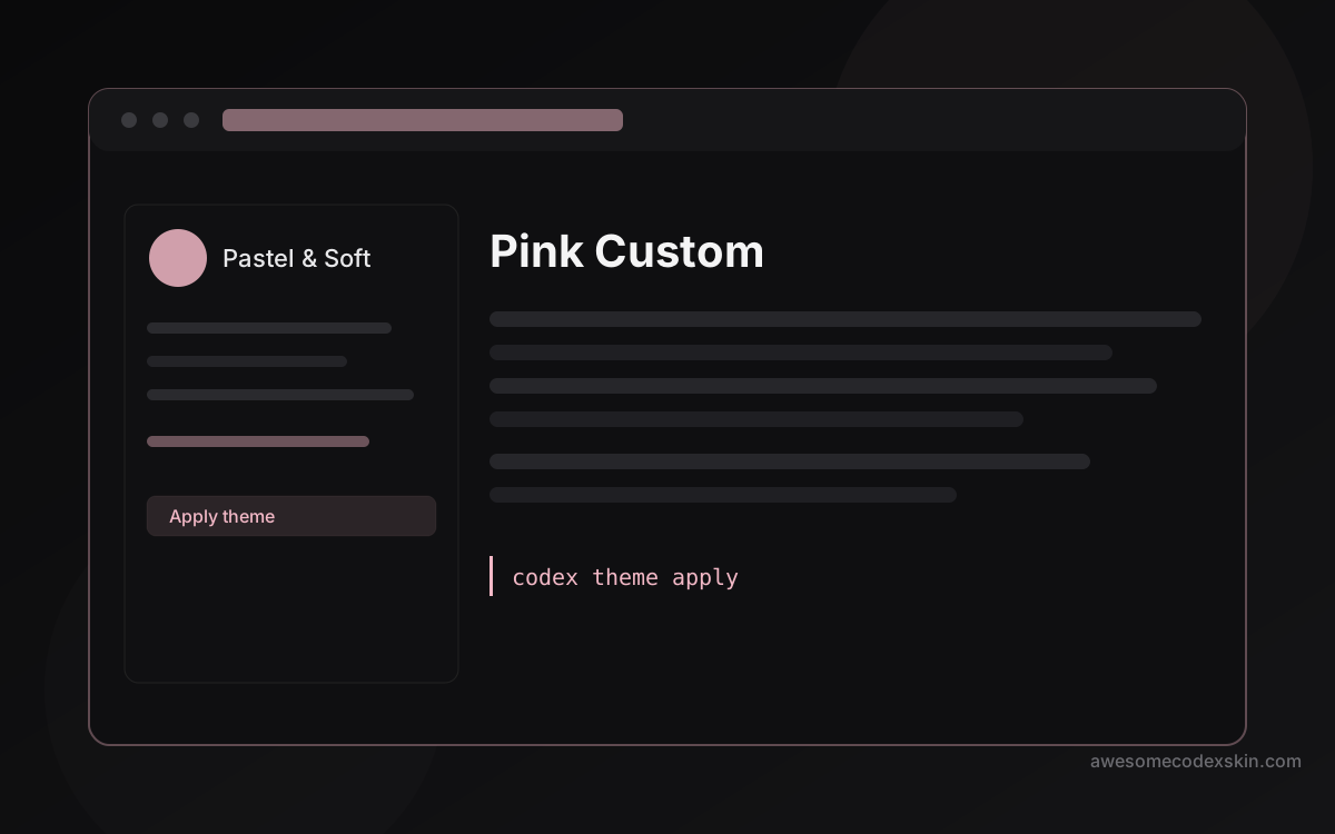
Pink Custom is what the name says — a customizable pink skin where you can dial the saturation up or down. If Sakura Pink Dawn feels too strong for you, Pink Custom lets you find the middle ground. If it feels too weak, you can push it further.
The flexibility makes it a good second choice after you have settled on a base palette. Start with Sakura, see what you like about it, then migrate to Pink Custom and fine-tune the values until the skin feels like it was made for your specific monitor.
How light skins compare to dark skins
The light-airy vs dark-midnight debate is the oldest argument in the Codex community. Here is the practical answer: light skins win in daylight, dark skins win in darkness. That is it.
If you code near a window during the day, a light theme reduces the glare that a dark screen creates against a bright background. If you code at night with only your monitor as the light source, dark mode is almost always more comfortable.
Neither approach is universally better. The best skin is the one that matches your environment on the days you use it most.
When to switch back and forth
Some people commit to one palette for months. Others switch with the seasons. There is no wrong answer. The Codex skin system makes it easy to swap themes without losing your settings, so you can test a light skin for a week and move back to dark if it does not feel right.
The light-airy category is worth trying at least once if you have never used a light theme seriously. You might find that your eyes prefer it more often than you expected.
Which light skin should you start with?
- Clear Glass if you want something neutral and professional
- Berry if you want soft pastel tones that feel gentle
- Sakura Pink Dawn if you want personality with your readability
- Pink Custom if you want to dial the saturation yourself
All six light-airy skins are free and installable through the Codex theme manager. The light vs dark comparison guide goes deeper into the ergonomics if you want to make a more informed choice.
Browse all light-airy skins → light-airy category
Скины из этого поста
 Clear Glass 1,620 установок
  Berry (light journal) 530 установок
  Sakura Pink Dawn 1,020 установок
  Pink Custom 650 установок
 Посмотреть все skins .