Light vs Dark Codex Skins: Pick by How You Work
Dark for deep focus, light for daylight and demos — but it's not that simple. Luminance, room lighting, screen size, and which Codex skins fit each scenario.
The light-vs-dark debate is the oldest argument in developer aesthetics, and the answer is the same as most aesthetic arguments: it depends. But “it depends” is useless without criteria. Here are the real factors, and which Codex skins in this index fit each scenario.
The actual science, briefly
- Dark themes reduce screen brightness, which helps in low-light rooms and for people sensitive to bright surfaces. The catch: in a bright room, a dark screen reflects more glare and can make text harder to read.
- Light themes reflect ambient light instead of fighting it, so they often read better in daylight. The catch: a bright white surface in a dark room is hard on the eyes.
- Pure black is not your friend in either mode —
#000backgrounds create halation; pure white text on pure black is genuinely worse for readability than a dark-gray pair.
The rule of thumb: match your theme’s luminance to your room’s luminance. Bright room → light theme. Dark room → dark theme. It’s the same reason phones have automatic light/dark modes.
Dark Codex skins: best for
- Deep focus sessions at night. A dark theme like Gothic Void Expedition keeps the screen from dominating your peripheral vision.
- Low-light offices. Same reasoning.
- Blue-light sensitivity. Warm dark themes — Amber Nocturne is a good example — are gentler on evening eyes than cool ones.
Watch out for: dark themes in bright rooms. If you’re by a window, a dark screen turns into a mirror.
Light Codex skins: best for
- Daytime, near windows. Berry (light journal) or Clear Glass read cleanly against daylight.
- Screenshots and demos. Light themes photograph better and feel more “default” to viewers.
- People with astigmatism. Many report less eye fatigue with light themes because text edges are sharper against a bright background.
Watch out for: light themes in dark rooms. Full-brightness white at 2 AM is the hardest thing on your eyes short of staring at a lamp.
The hybrid setup
You don’t have to pick. The best setup for most people:
- Day default: a light theme like Clear Glass.
- Night default: a dark theme like Gothic Void Expedition.
- Switch when the room changes — or automate it with your OS’s night mode if your engine supports theme-on-time.
This is what your phone does every day. Your editor can too.
Quick FAQ
Is dark mode better for battery life? On OLED screens, mildly — dark pixels use less power. On LCD (most desktop monitors), essentially no difference.
Are dark themes better for coding in general? No scientific consensus. It’s preference plus room lighting. The “dark = pro” belief is cultural, not physiological.
Can I use a light skin but keep dark panels? You can, but mixed luminance is the worst of both worlds — your eyes re-adapt constantly. Pick one side, or a theme designed as a cohesive light system like Berry (light).
What’s the single best pick if I can only have one? A balanced dark theme — Gothic Void Expedition — because dark works in most rooms, and you can pair it with OS night-mode brightness. If you’re mostly in daylight, make it Clear Glass instead.
Match your theme to your room, not to a trend. Light for daylight and demos, dark for nights and focus, and the hybrid setup if you want both. Browse the full skin index — it’s organized by light and dark categories so the choice is easy — or read the eye-care guide for the settings that matter either way.
In diesem Beitrag erwähnte Skins
 Berry (light journal) 530 Installationen
 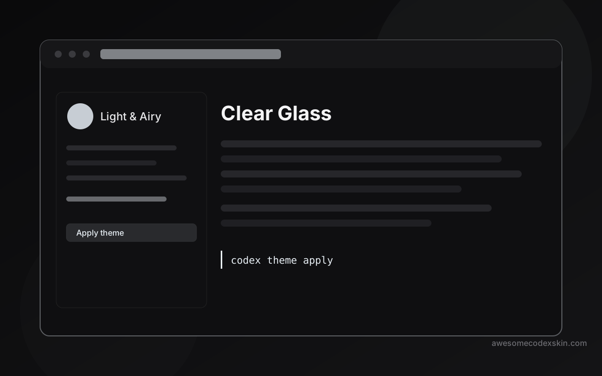 Clear Glass 1,620 Installationen
 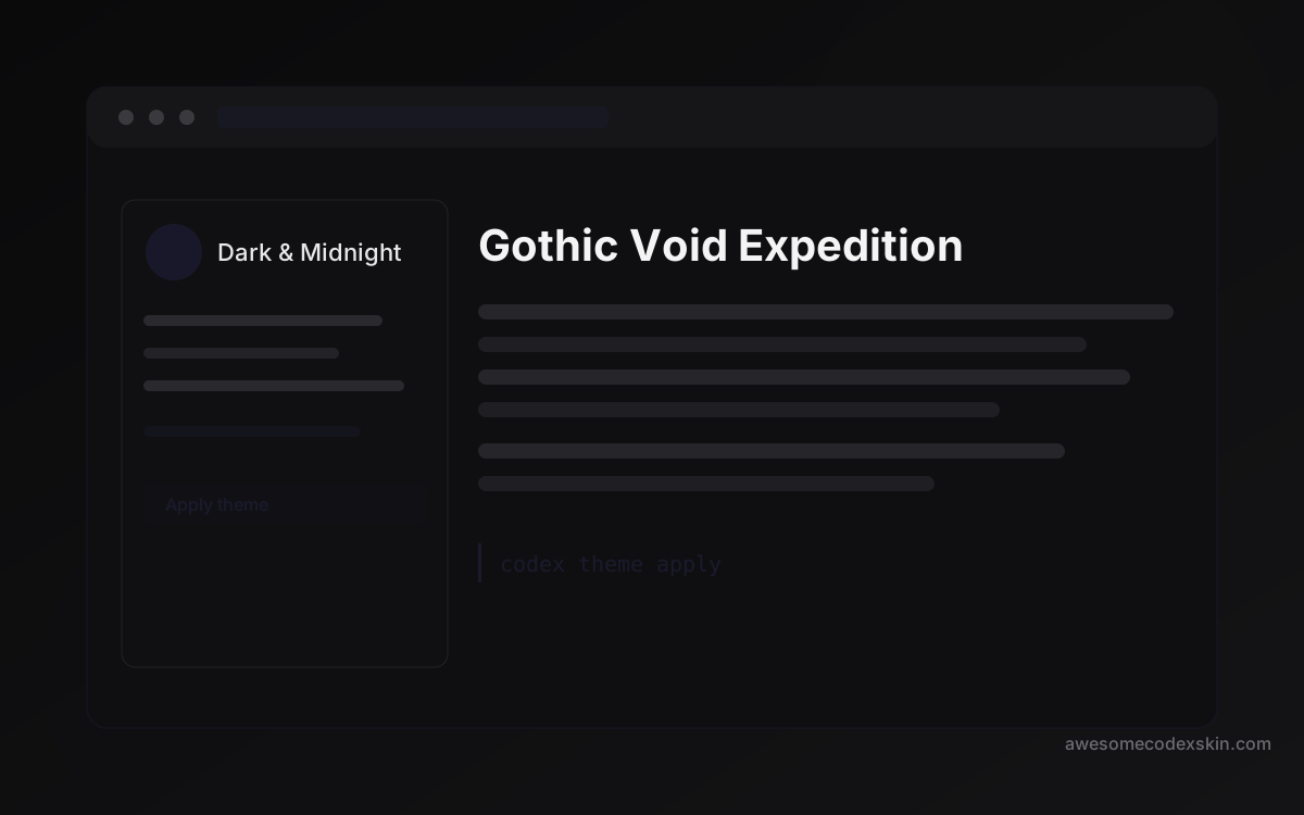 Gothic Void Expedition 2,103 Installationen
 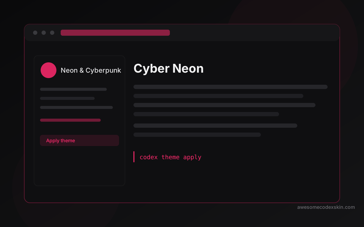 Cyber Neon 1,180 Installationen
 Alle ansehen skins .