High-Contrast Codex Skins: Accessibility That Looks Good
High-contrast code themes are usually ugly or unusable. Here is what actually makes a skin accessible, which contrast ratios matter, and how to pick one you can read for hours.
High-Contrast Codex Skins: Accessibility That Looks Good
High contrast has a branding problem. The phrase brings to mind pure white text on pure black, a palette that is technically accessible and exhausting to read for more than ten minutes. That trade-off is not real. A skin can be readable for hours and still hold up to a contrast check.
What contrast actually needs to be
The accessibility target for body text is a contrast ratio of 4.5 to 1 against the background. For large text and non-text elements it drops to 3 to 1. That is the floor, not the goal.
The useful detail is what happens above the floor. Pushing contrast far past the requirement, toward pure black and pure white, tends to increase perceived glare. Many people with light sensitivity find maximum contrast harder to read than a well-chosen 7 to 1.
Where code themes fail
Three failure modes show up again and again in code skins.
Comment text that disappears. Comments are usually the lowest-contrast element by design, which makes them the first to fall below the floor. If you skim comments to navigate a file, this matters more than the syntax colours.
Colour-only distinction. A skin that separates types from variables using two similar hues fails anyone with colour vision deficiency, and fails everyone in bright sunlight. Weight and italics do the same job without relying on hue.
Chrome that fights the editor. Sidebar and panel text at low contrast is a frequent omission, because preview images focus on the code area.
A short checklist
- Measure comment text and sidebar text, not just syntax keywords.
- Check the skin in bright light. Glare is where high-contrast palettes actually get tested.
- Confirm that paired tokens differ in more than hue.
- Read a full file, not a short snippet. Contrast problems show up in volume.
- Try it for a week before deciding.
Skins that get this right
Clear Glass stays comfortable because it holds contrast around 8 to 1 instead of pushing to the maximum, and it keeps comment text legible rather than faded to near-invisible. Monokai Stone takes a different route, using heavier font weight for comments so they can stay lower in contrast without becoming unreadable. Solarized was built around measured luminance relationships rather than aesthetic preference, which is why it has survived so long.
Cyber Neon is the interesting counterexample. It runs high saturation rather than high contrast, which reads as vivid but does not satisfy a contrast check. It is not an accessibility skin, and treating it as one leads to disappointment.
Why this matters beyond accessibility
Readable code is faster to debug. When a token is hard to distinguish, you spend attention on decoding it instead of on the problem. High-contrast work is not only a service to people with low vision. It is a straight improvement in how quickly you read your own code.
中文摘要
高对比度这个词有个品牌问题。它让人想到纯黑底纯白字,技术上达标,但读十分钟就累。这个取舍其实不成立:一套皮肤可以既耐读,又通过对比度检查。
正文给出具体标准:正文对比度目标是 4.5 比 1,大字号降到 3 比 1,这是下限不是目标。真正的问题往往出在超过下限太多,往纯黑纯白推反而增加眩光感。
代码主题最常见的三种失败:注释文字对比度不足、只用颜色区分语法类型(对色觉障碍和强光环境下都失效)、以及侧边栏和面板文字被忽略。文章给出了五项检查清单,以及 Clear Glass、Monokai Stone、Solarized 各自用什么方式处理对比度。Cyber Neon 是反例:它走高饱和路线,视觉上很亮,但过不了对比度检查。
Where to Start
Browse the skin index and filter to the ones you can read at a glance. The dark and midnight category holds most of the accessible options. Every skin on this site is indexed at awesomecodexskin.com, and anything not covered here is answered on the FAQ page.
Скины из этого поста
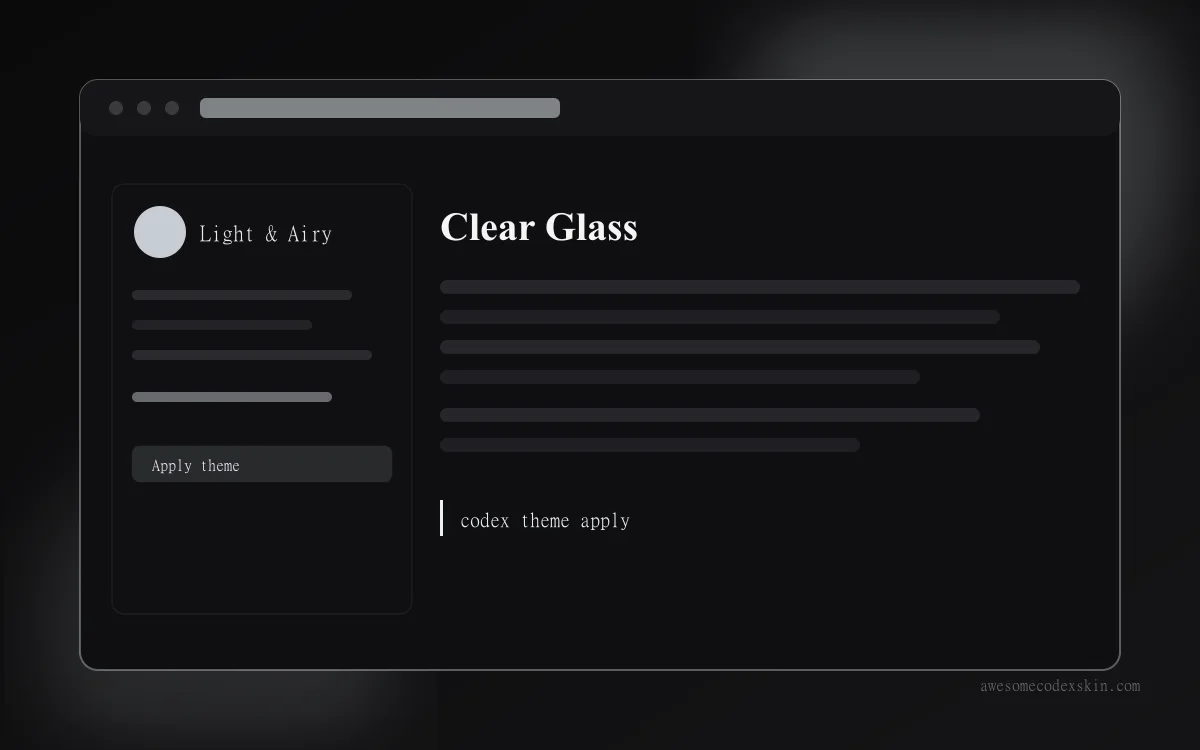 Clear Glass ~1,620 установок (оценка)
 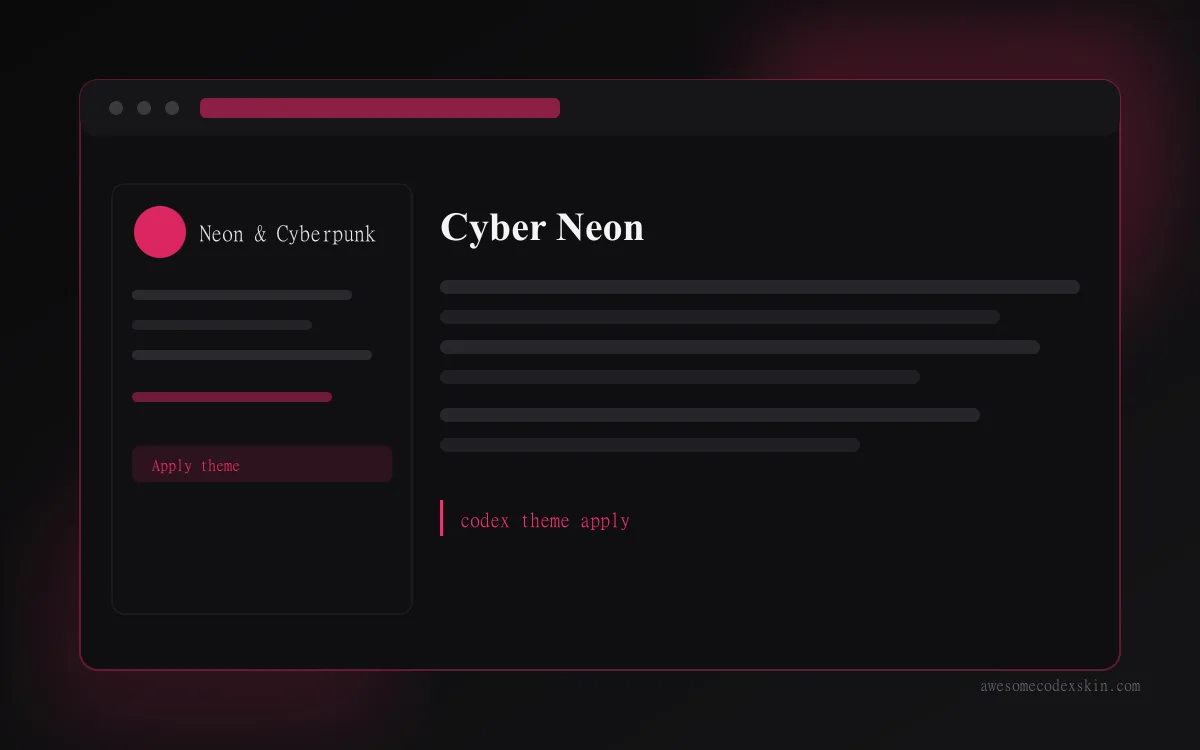 Cyber Neon ~1,180 установок (оценка)
 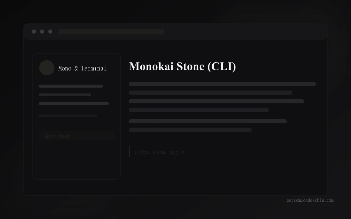 Monokai Stone (CLI) ~1,500 установок (оценка)
 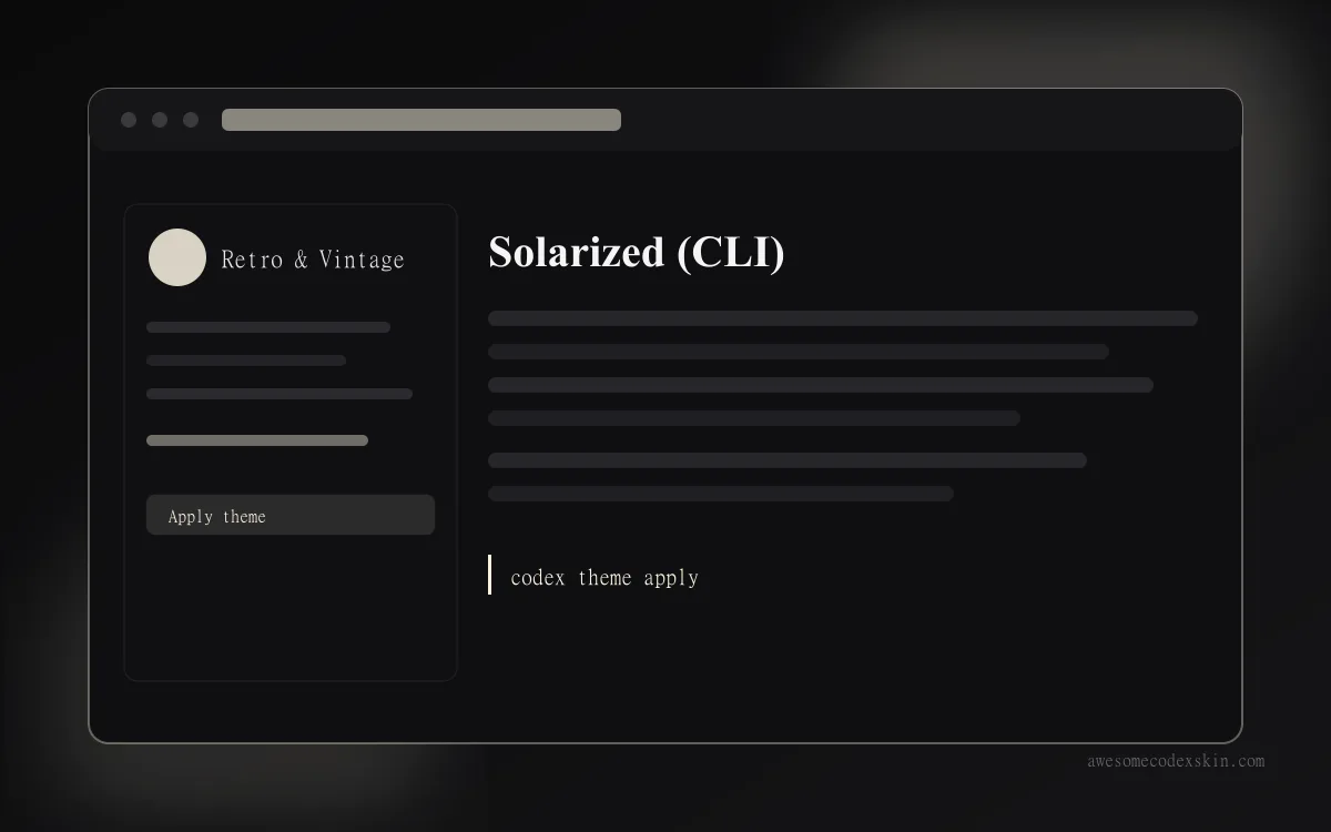 Solarized (CLI) ~1,340 установок (оценка)
 Посмотреть все skins .